The Den is a brand that is very near and dear to me. It was one of the first gyms, when moved to Denver, that made me feel excited and hopeful for my future in fitness.
When the owners approached me to do a complete from-the-ground-up rebrand, I knew it was an offer I couldn’t turn down.
When it came to rebuilding this brand, it was important to capture the image that the client wanted their brand to be perceived as. Approachable and human. Straying away from the hyper-masculine persona that many gyms tend to exhibit in their area. So we created a dialogue for me to better understand what they were looking for:

After creating a series of directions for the client to choose from, we landed on “Mens Est Corpus, Corpus Est Mens” (the mind is the body, the body is the mind). This direction feels relatable to multiple demographics and doesn’t feel too polarized. Most importantly, it also appeals to the aesthetic and vibe of the founder, Kyle, making it feel genuine to his persona.
To accompany the direction, I also created a rationale for a color palette, typeface, as well as dabbled in some icon variations that would ultimately boil down to the final logo mark.


Using what the client liked from the direction’s rationale, I began brainstorming logo marks that aligned with the message we were trying to convey. The client liked the idea of the Vitruvian Man but didn’t want it to come off too masculine or aggressive. He liked the aspects that tapped into balance and composition.
So for the initial marks, I played with some imagery that nodded to the human form and symmetry, but nothing that hit you too over the head with it. The goal was to create an iconic mark that felt custom and relatable to the message of the brand.
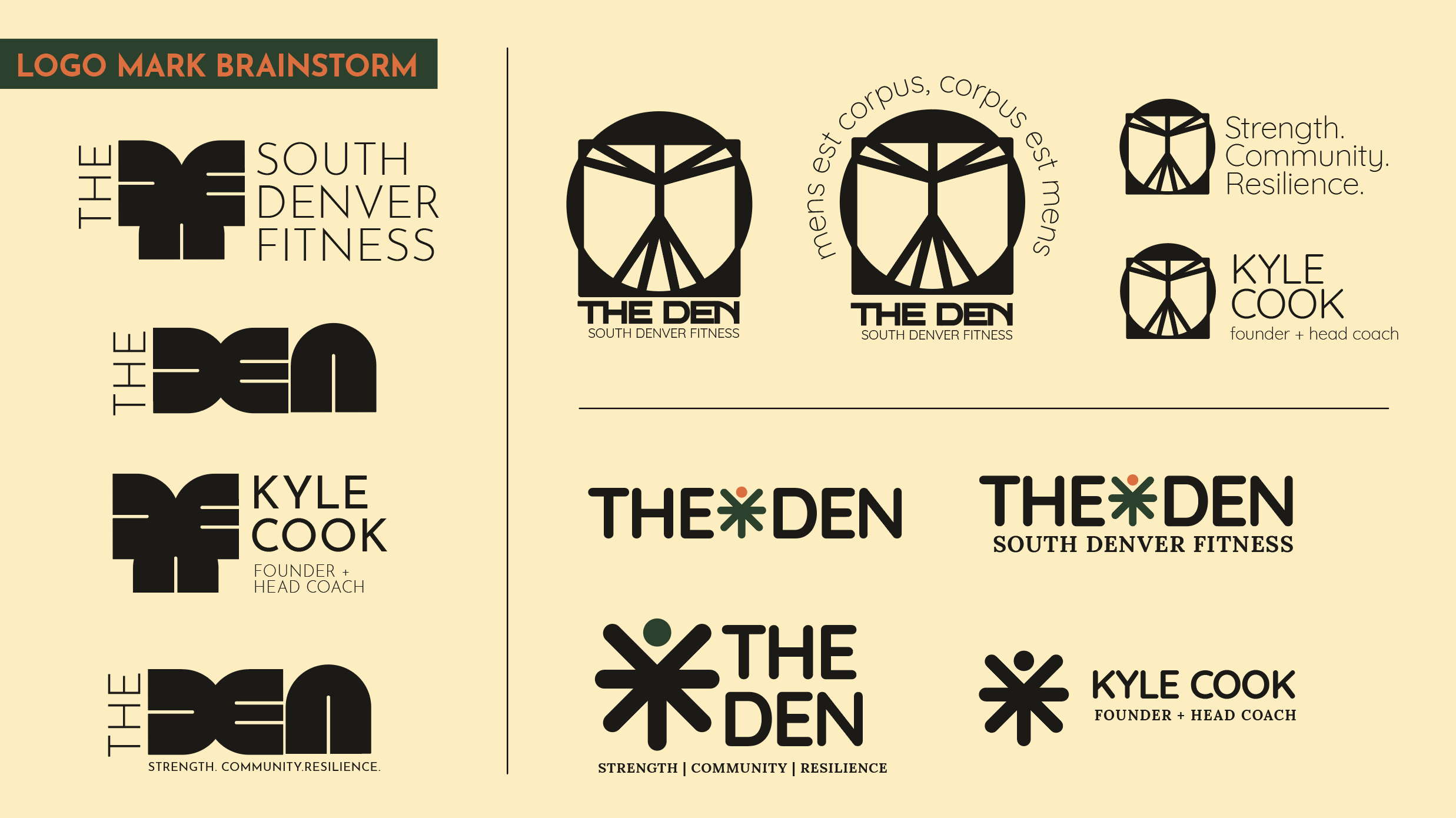
The client was drawn to the custom, symmetrical shape that I created on the far left of the page above, but felt like “Den” was hard to define. So after some workshopping, we came up with the final lockup, and began building out the final brand guide: